There’s no doubt, ever since Material design went into full effect with the debut of Android Lollipop, Google has reshaped how apps are colored within Android and how they interact with each another. Being a set of rules and design cues introduced by Google, there’s no doubt Google has fell slightly short of their promises or visions.
With Material Design, Google allowed users to understand everything happening on your phone. From the icons to the animations to the simple color schemes, Material Design allowed users to get a much deeper understanding of how they’re interacting with devices today.
User Experience is a very important factor when designing the UI of any interface. It tells the user what to do, what to expect and what type of design language that app serves. Google has a number of employees working on improving Material Design as we speak and it seems like a UI designer who goes by the name of Gabriel Zegarra has just taught how a consistent Material Design would look like in a concept.
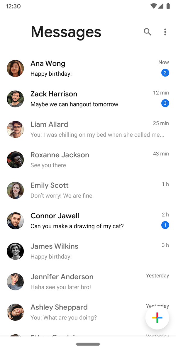
The UI redesign features everything Google has committed to. From the ease of use to the massive improvements in usability and the overall feeling. The UI designer even as went as far to show off his vision for Google’s own suite apps. He redesigned the UI of the Play Store, Google Music, Google Movies, Google Games, Google Books, Allo, Calendar and whole lot more. The amount of work put into the redesign has to be respected and seems to be meeting Google’s own guidelines for Material Design. We get to see the classic curves here and there, along with a blush of button schematics that everyone would appreciate.
The full showcase is available on Behance right now for those who are interested. Since Google hasn’t perfected Material Design yet to the fullest extent, we’re definitely sure that Google could pick up on a ton of inspiration from the UX designer.